

There is something clarifying about a very small space. When every square metre has to earn its place, every design decision becomes more deliberate. The furniture that would be convenient in a larger home but not essential gets cut. The storage that works adequately in a spare room needs to work brilliantly in a compact one. The material that looks fine on a large surface needs to look exceptional up close. The result, when the design is done well, is an interior with a quality of intention and resolution that larger spaces rarely achieve.
The most impressive compact interiors, whether tiny homes, converted vehicles, micro apartments, or small studios, apply a set of principles that are worth understanding regardless of the scale you are working at. Good design under constraint is simply good design made visible.
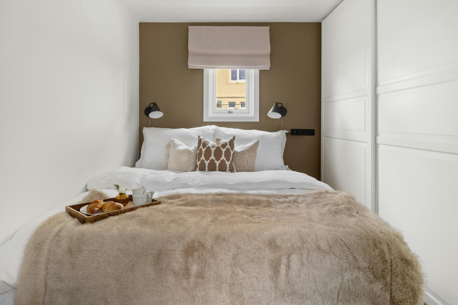
In a large home, a piece of furniture that serves a single purpose in a single way is acceptable. In a compact space, it is a liability. The discipline that spatial constraint imposes is a ruthless evaluation of every element against the question: does this earn its place?
A sofa that opens into a bed. A dining table that folds against the wall. A bench with storage underneath. Overhead cabinetry that runs to the ceiling. These are not compromises. They are design solutions that make a small space feel generous rather than cramped, because every cubic metre has been considered rather than simply occupied.
This principle applies directly to any home regardless of its size. Walking through each room and asking whether every piece of furniture is genuinely necessary, whether it serves its function well, and whether something could replace it that serves two or three functions equally well, is one of the most useful exercises available in any interior design project. The storage article published separately on this site explores this principle in depth for every room of the home.
In a large room, a material of mediocre quality can be absorbed into the overall impression of the space without significantly undermining it. In a compact space, every surface is within arm's reach and every material is inspected at close range. The quality of a timber finish, the weight of a fabric, the solidity of a hinge, the smoothness of a drawer slide: all of these are experienced directly and continuously by anyone living in a small space.
The most impressive compact interiors almost always use materials of genuinely high quality. Not necessarily expensive materials, but ones that are appropriate for their application, well-finished, and chosen with the understanding that they will be seen, touched, and used constantly rather than occasionally. Teak in a bathroom, flush cabinetry with quality hardware, a benchtop in a real stone or solid timber rather than a laminate approximation: these choices make a compact space feel genuinely luxurious rather than merely small.
The lesson for any interior is that quality of material is more important at a human scale than at an architectural scale. The surfaces people touch every day deserve more investment than the surfaces they simply look at.
One of the most reliable techniques in compact interior design is the use of flush cabinetry that sits seamlessly against walls and ceilings without visible frames, gaps, or protruding handles. When storage disappears into the walls rather than projecting from them, the room feels larger than it is because the eye reads the surface as continuous rather than interrupted.
This principle of visual continuity, of reducing the number of edges, joints, and projections that the eye registers as separate objects, is one of the most effective tools available for making a small space feel more generous. Integrated appliances that sit flush with cabinetry fronts. Door handles recessed rather than projecting. Shelving that runs from wall to wall without a visible bracket. These details collectively create an interior that feels resolved and complete rather than assembled from separate pieces.
Dulux offers a range of paint colours that suit the flush, minimal cabinetry aesthetic particularly well, especially in their warm white and off-white ranges that work with timber and stone accents without creating sharp tonal contrasts that fragment the visual field.
In a compact space, natural light is not simply pleasant. It is a structural necessity. A small space with generous natural light feels open and habitable. The same space without natural light feels enclosed and uncomfortable regardless of how well it is designed in every other respect.
The most impressive compact interiors prioritise natural light with a commitment that larger homes rarely match. Skylights positioned directly above work surfaces or sleeping areas. Windows extending to the ceiling rather than stopping at a conventional head height. Glass panels that borrow light from adjacent spaces. A roof window or sky panel above a bed that allows occupants to see the stars at night and the sky during the day.
These solutions are available in any home, not just tiny ones. A skylight above a dark hallway. A glass panel between a bathroom and an adjacent room. A clerestory window above a kitchen splashback. Each of these brings natural light into spaces that conventional window placement cannot reach and creates the sense of connection to the outside world that makes any interior feel more generous.
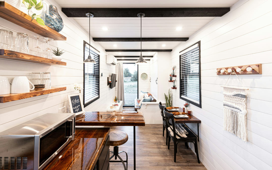
The most spatially efficient compact interiors do not divide themselves into rooms in the conventional sense. They create zones, areas with a specific character and purpose defined by furniture arrangement, material change, or lighting rather than by walls and doors. A sleeping zone that reads as distinct from a living zone despite sharing a single open space. A working zone that feels separate from a dining zone despite being adjacent.
This zoning approach requires more design thought than simply putting walls in the conventional positions but produces interiors that feel more flexible, more spacious, and more responsive to how people actually live. The living room article and the home office articles published separately on this site both address specific aspects of this zoning challenge in domestic contexts.
The principle scales upward as well as downward. In a larger home, designing open plan spaces through deliberate zoning rather than physical division produces the same quality of spatial flexibility and can create a more interesting and more liveable result than a conventionally divided floor plan.
In a compact interior, the relationship between inside and outside becomes critically important. A small space that opens directly onto an outdoor area, whether a deck, a courtyard, a terrace, or simply a generous window that frames a view, feels significantly larger than the same space without that connection. The eye and the mind extend beyond the physical boundaries of the interior when there is something worth seeing beyond them.
The most successful compact homes design the outdoor connection as carefully as the interior. A deck that extends the living area during good weather. An awning that makes the outdoor space usable in the shoulder seasons. A view framed deliberately by a window or opening rather than simply visible through a standard glazed panel.
This principle is one of the most consistently valuable in any scale of residential design. A home that connects well to its outdoor spaces always feels more generous than one that treats the exterior as a separate zone accessible only through a back door. The beach house and country home articles published separately on this site explore this principle in specific landscape contexts.
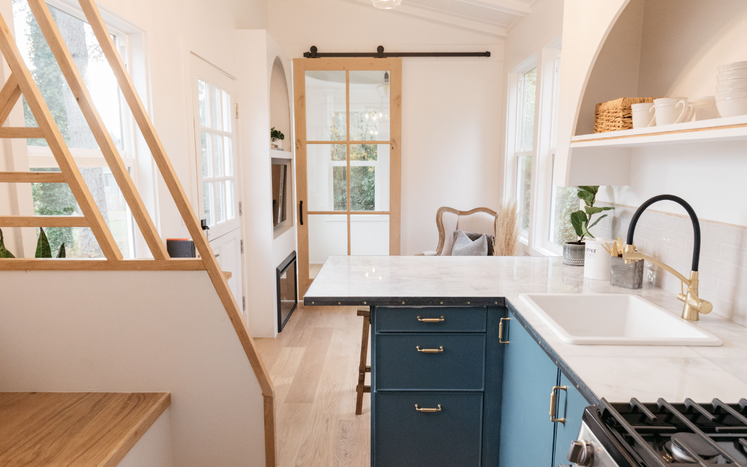
The most counterintuitive lesson from the world of compact and tiny home design is that spatial constraint, when embraced rather than resisted, produces design outcomes that are often more interesting and more resolved than those achieved in unconstrained spaces.
When there is no room for the unnecessary, the necessary becomes more visible and more considered. When every material is seen up close, quality becomes non-negotiable. When natural light cannot be taken for granted, its introduction becomes a design priority rather than an afterthought. When zones must be defined without walls, spatial design becomes more sophisticated and more intentional.
These are lessons worth applying in any interior, regardless of its size. The question of whether every element earns its place, whether the materials are genuinely appropriate to their use, whether natural light has been maximised, and whether the space connects well to the world beyond its walls, improves any interior when asked honestly and answered with genuine commitment.
If you are working with a compact space and would like help making the most of it, or if you would like to apply these principles to a larger home that could benefit from more considered design, get in touch. Spatial efficiency and design quality are not in competition. The best compact interiors demonstrate that they are the same thing.


